Community
Support Community Re-design


The Vision
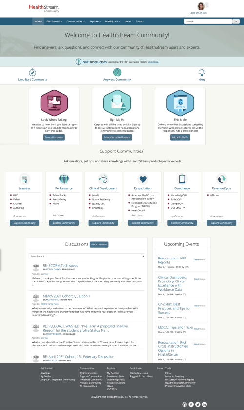
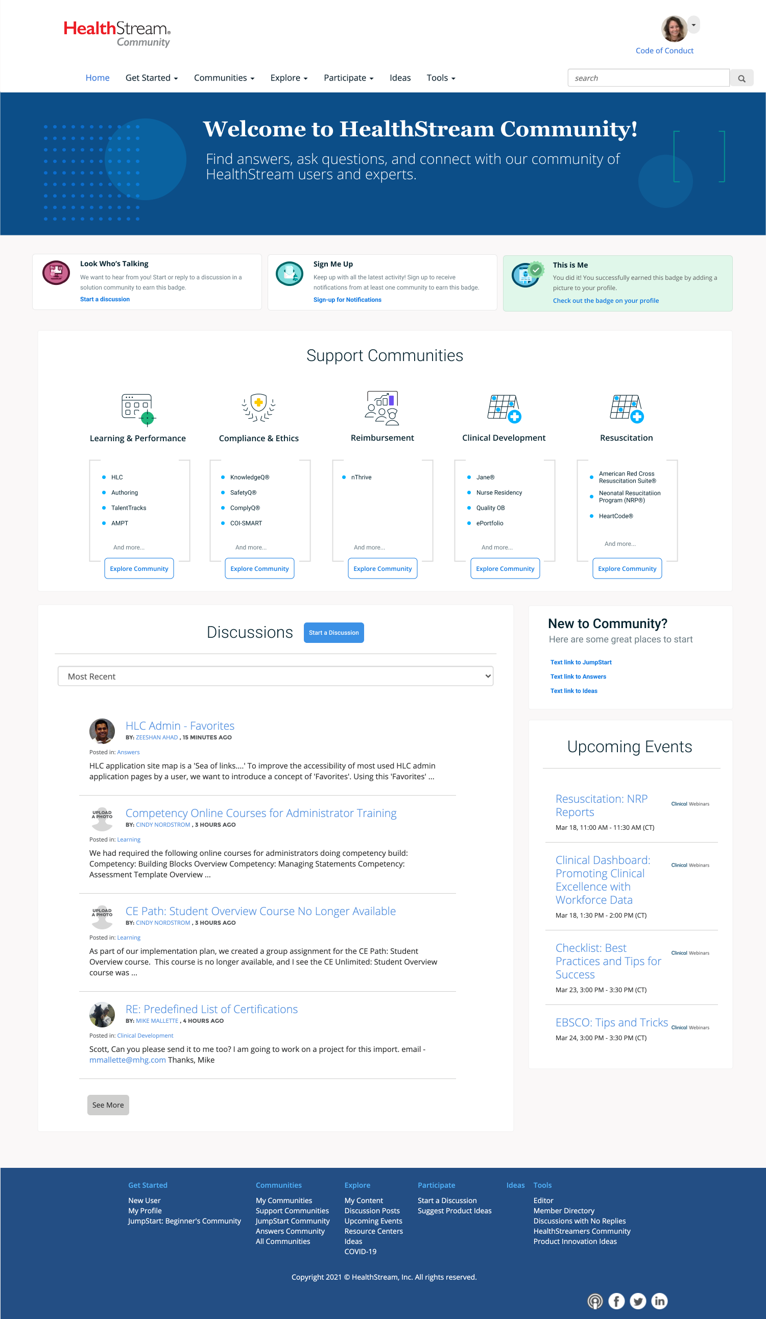
HealthStream Community functions as the support community, and a place for customer success managers to host best practice documentation for customers. They are able to post product ideas, ask each other questions, and receive tier 0 support from customer success managers. In the past community was difficult to use and rarely updated. No support content whatsoever was uploaded. The new community not only included an update to the UI, but to the entire process of how Healthstream gives support to customers. It gives them the opportunity to learn from each other and search for questions that have already been answered, rather than having to call into customer service for every question that they have.
The Design Process
I used Figma to for initial designing and to communicate ideas to stakeholders. I completed virtual user testing, which led us to the design to break the support community into smaller communities, since many customers only have one or two products and don’t want to see support questions for every single product. The first design was in keeping with brand guidelines at the time, but the company-wide design refresh afforded the opportunity to upgrade to a more modern experience. I took advantage of the refresh to make some UI changes, so that the most clicked on links in Google Analytics were located above the fold and visually took the focus off components that weren’t being utilized as heavily.
The Tech Stack
- HigherLogic CMS
- HTML, CSS, and JS
- jQuery
- Figma